
Every Monday morning, thousands of small business owners open their analytics and stare at a wall of numbers — not sure what matters, what changed, or what to do about it. Then they close the tab and move on. Sound familiar? The problem isn’t the data. It’s the lack of a simple, repeatable process. This free analytics report template fixes that. Ten minutes, once a week, zero cost — and you’ll finally know what’s working.
I’ve been building weekly reports for clients for years, and the ones that actually get read and acted on all follow the same structure. In this guide, I’ll show you exactly what to include, which free tools to use, and how to automate most of it so it practically builds itself.

Why You Need a Weekly Analytics Report
Monthly reports are too slow. Daily reports are noise. Weekly is the sweet spot for small businesses — frequent enough to spot trends, infrequent enough that the data is meaningful. Here’s what a good weekly report gives you:
- Early warning system. A traffic drop on Monday is easier to fix than one you discover four weeks later.
- Accountability. When you see the numbers weekly, you make better decisions about where to spend your time.
- Team alignment. Share the report with your team and everyone sees the same picture. No more guessing.
- Client trust. If you’re a freelancer or agency, a clean weekly report makes you look professional — even if you built it for free.
And the best part? You don’t need to pay for any reporting tool. Everything in this guide uses free software.
The 7 Metrics Your Free Analytics Report Template Should Include
Skip vanity metrics like total pageviews in isolation. Focus on numbers that tell you something actionable. After testing dozens of report formats, these seven metrics consistently provide the most value for small businesses:
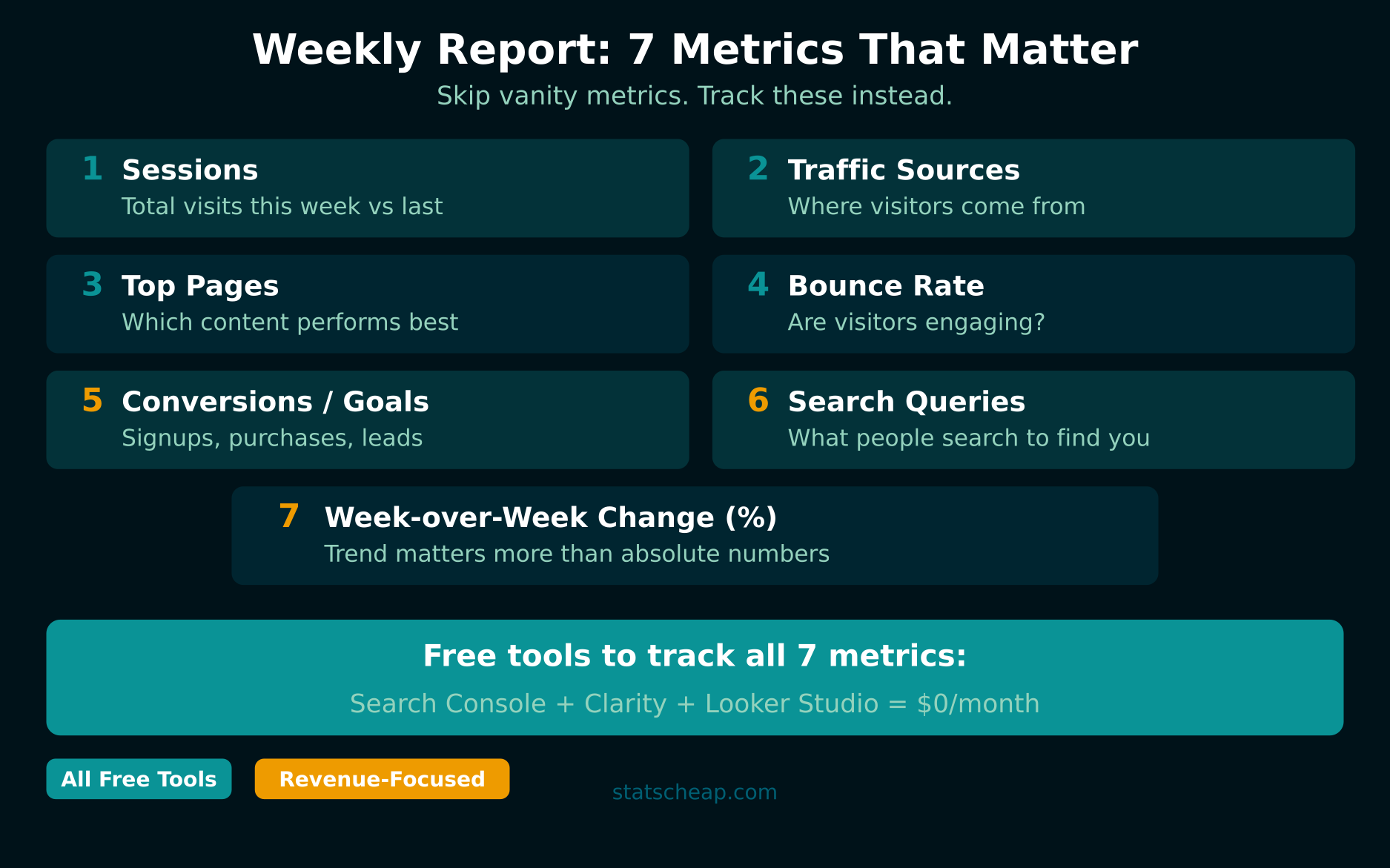
1. Sessions (Total Visits)
The most basic health check. How many visits did your site get this week compared to last week? A sudden drop means something broke — a page went down, a campaign ended, or rankings shifted. Always show the week-over-week percentage change, not just the raw number.
2. Traffic Sources Breakdown
Where are your visitors coming from? Break it down into organic search, direct, social, referral, and email. This tells you which channels are pulling their weight. If you’re using UTM parameters on your campaigns, you’ll see even more granular source data here.
3. Top 10 Pages
Which pages got the most traffic this week? This reveals what content resonates with your audience. Compare to last week — did a blog post suddenly spike? Did a product page lose traffic? These shifts drive your content and marketing decisions.
4. Bounce Rate (or Engagement Rate)
Are visitors actually engaging with your site, or leaving immediately? A high bounce rate on a landing page means the page isn’t delivering what the visitor expected. Track this per traffic source — organic visitors often engage differently than social traffic.
5. Conversions and Goals
Whatever matters most to your business — newsletter signups, contact form submissions, purchases, demo requests — track it weekly. This is the metric that connects your analytics to actual business results. If conversions drop while traffic stays flat, your site experience needs work.
6. Search Queries (from Search Console)
What are people typing into Google to find you? This data comes from Google Search Console (free) and shows your top queries by clicks and impressions. Watch for new queries appearing — they’re opportunities to create more content.
7. Week-over-Week Change
For every metric above, show the percentage change from last week. Raw numbers without context are meaningless. “500 sessions” means nothing. “500 sessions, up 23% from last week” tells a story. This is what turns a data dump into an actionable report.
Free Analytics Report Template: The Structure
Here’s the exact report layout I use for clients. It works in Looker Studio (ideal for automated dashboards) or in a simple Google Sheet (if you prefer manual control).
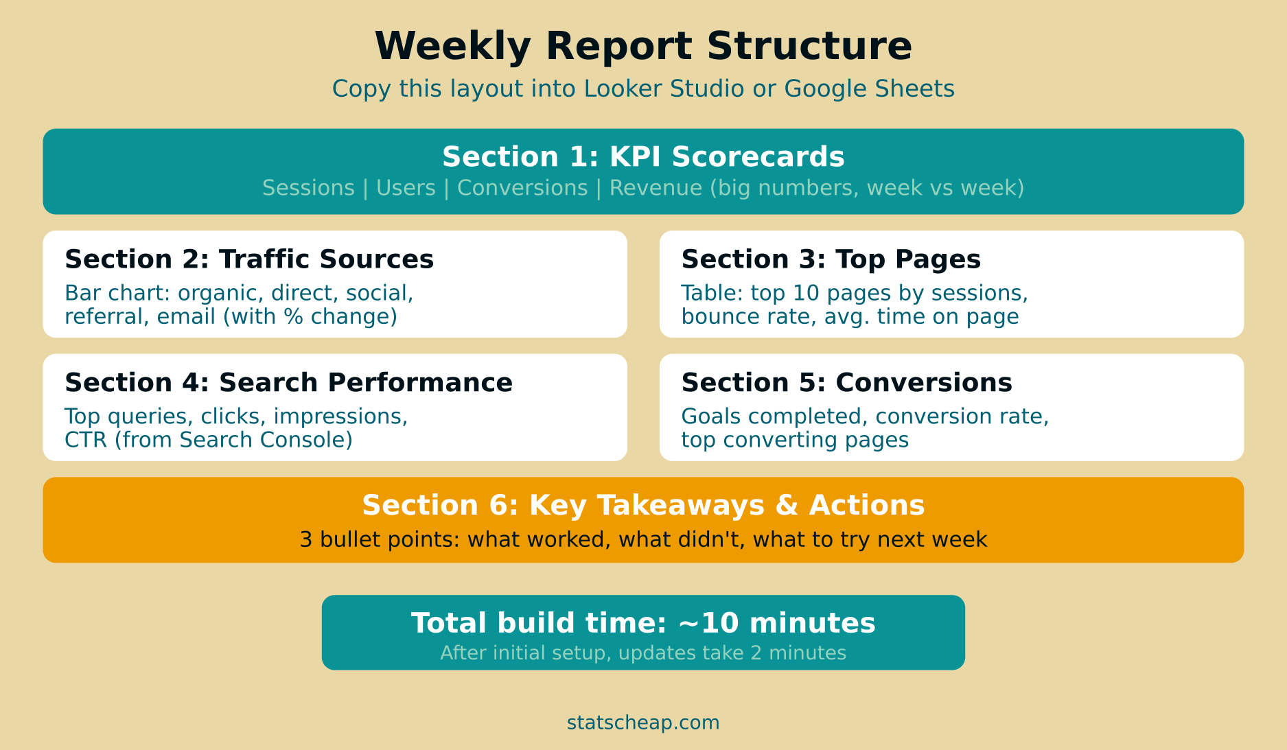
Section 1: KPI Scorecards (Top of Report)
Four big numbers across the top: Total Sessions, Total Users, Conversions, and Revenue (if applicable). Each with a comparison arrow showing up or down vs. last week. In Looker Studio, use the “Scorecard” chart type with comparison date range enabled. In Google Sheets, just bold the numbers and add a percentage change column.
Section 2: Traffic Sources (Bar Chart)
A horizontal bar chart showing sessions by source: organic, direct, social, referral, email. Color-code each channel. Add last week’s numbers as a second bar for instant comparison. This section answers “where are people coming from?” in one glance.
Section 3: Top Pages (Table)
A sortable table with columns: Page Title, Sessions, Bounce Rate, Avg. Time on Page. Limit to top 10 pages. Sort by sessions descending. This shows your best-performing content at a glance.
Section 4: Search Performance
Top 10 search queries from Google Search Console with clicks, impressions, CTR, and average position. This is SEO gold — you’ll spot keyword opportunities and ranking changes before they show up in traffic numbers.
Section 5: Conversions
Goals completed this week, conversion rate, and top converting pages. If you track user behavior with heatmaps, add a note about any UX observations from session recordings.
Section 6: Key Takeaways and Actions
This is the most important section. Three bullet points:
- What worked this week — a campaign that drove traffic, a page that converted well.
- What didn’t work — a channel that underperformed, a page with rising bounce rate.
- What to try next week — specific actions based on the data above.
Without this section, your report is just data. With it, it’s a decision-making tool.
How to Build This Report for Free
You have two paths — both completely free:
Option A: Looker Studio (Automated)
The best option if you want the report to update itself. Connect your data sources once, build the layout, and it refreshes automatically every time you open it. You can even schedule weekly email delivery so stakeholders get a PDF every Monday morning.
- Cost: $0
- Setup time: 30-45 minutes (one-time)
- Weekly maintenance: 2 minutes (add takeaways section)
- Data sources: Search Console, Google Sheets, CSV files
Option B: Google Sheets (Manual)
If you prefer full control or your data is already in spreadsheets, a Google Sheets template works well. You’ll manually copy the numbers each week, but it takes less than 10 minutes once the template is set up.
- Cost: $0
- Setup time: 15-20 minutes (one-time)
- Weekly maintenance: 8-10 minutes (copy data, write takeaways)
- Best for: Teams who want to add manual commentary and context
Either way, you’re spending zero dollars on reporting tools. Most paid alternatives (Databox at $59/month, AgencyAnalytics at $79/month, Whatagraph at $199/month) offer convenience, but not $200/month worth of convenience for a small business.
Free Tools That Power Your Weekly Report

| Tool | Price | What It Provides for Your Report |
|---|---|---|
| Looker Studio | $0 | Dashboard builder, automated updates, email delivery |
| Google Search Console | $0 | Search queries, clicks, impressions, rankings |
| Microsoft Clarity | $0 | Heatmaps, session recordings, engagement metrics |
| Google Sheets | $0 | Manual data tracking, custom calculations |
For the complete picture of building a free analytics stack, check out our guide on how to build a full analytics stack for $0.
Common Weekly Report Mistakes to Avoid
- Too many metrics. Seven is the sweet spot. More than ten and nobody reads the report. Focus on what drives decisions, not what’s easy to measure.
- No comparison period. Absolute numbers without context are useless. Always compare to last week, last month, or last year.
- No takeaways section. A report without interpretation is just a screenshot of your analytics. The takeaways section is what makes it valuable.
- Tracking vanity metrics. Total pageviews, total followers, and total impressions feel good but rarely drive business decisions. Focus on metrics tied to revenue or growth.
- Not sharing it. A report that only you see is a diary. Share it with your team, clients, or stakeholders. Looker Studio makes sharing free and easy.
Frequently Asked Questions
Is there a free analytics report template I can copy?
Yes — and you don’t need to download anything. In Looker Studio, browse the Template Gallery for pre-built report layouts. For Google Sheets, create a new sheet with the six sections described above: KPI scorecards, traffic sources, top pages, search performance, conversions, and takeaways. That’s your free analytics report template — no paid tools required.
How long does it take to set up the first report?
In Looker Studio, expect 30-45 minutes for initial setup (connecting data, placing charts, styling). In Google Sheets, 15-20 minutes. After that, weekly updates take 2-10 minutes depending on how much manual commentary you add.
Should I send the report to clients as a PDF or a link?
Both have merits. A Looker Studio link lets clients interact with filters and date ranges — more engaging. A PDF (scheduled via Looker Studio) is easier for clients who just want a quick snapshot in their inbox. For most freelancers, I recommend sending both: the PDF for convenience and the link for deeper exploration.
What if I don’t have enough data yet?
Start anyway. Even with 50 visitors per week, a report helps you spot patterns. The structure matters more than the volume. As traffic grows, your report grows with it — and you’ll already have weeks of comparison data built up.
Bottom Line: 10 Minutes That Change Your Decision-Making
A weekly analytics report is the single cheapest investment you can make in better business decisions. Here’s your action plan:
- Pick your tool: Looker Studio for automated dashboards, Google Sheets for manual control. Both $0.
- Set up the 6-section template described above — KPIs, sources, top pages, search, conversions, takeaways.
- Track 7 metrics — sessions, sources, top pages, bounce rate, conversions, queries, and week-over-week change.
- Write 3 takeaway bullets every week — what worked, what didn’t, what to try next.
- Share it with your team every Monday. Consistency compounds.
You don’t need a $200/month reporting tool to make smart decisions. Ten minutes and a free analytics report template is all it takes. Smart beats expensive — especially on Monday mornings.